
Board of Directors
Brendan Royall
Chief Executive Officer
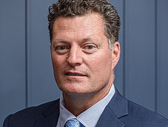
Tony Castro
President
Tony Giovannoni
Vice President
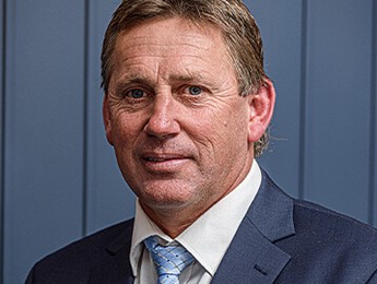
David Batt
Secretary
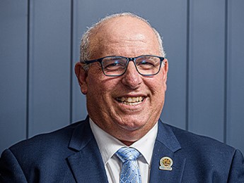
Rob Asnicar
Treasurer
Noel Stitt
Director
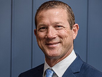
Nathan Freeman
Director

Leone Aslett
Director
Dine with us for great entertainment, great atmosphere and great times.